Copy these great features with your website.
Below are 5 different home pages that are from well known companies that are very effective at converting prospects to clients. No need to invent something new, just find out what is working for someone else and copy. They didn’t teach that to me at school.
Plus the most simple website that is worth billions.
-
This website was done by humaan.com and they have done a great job.
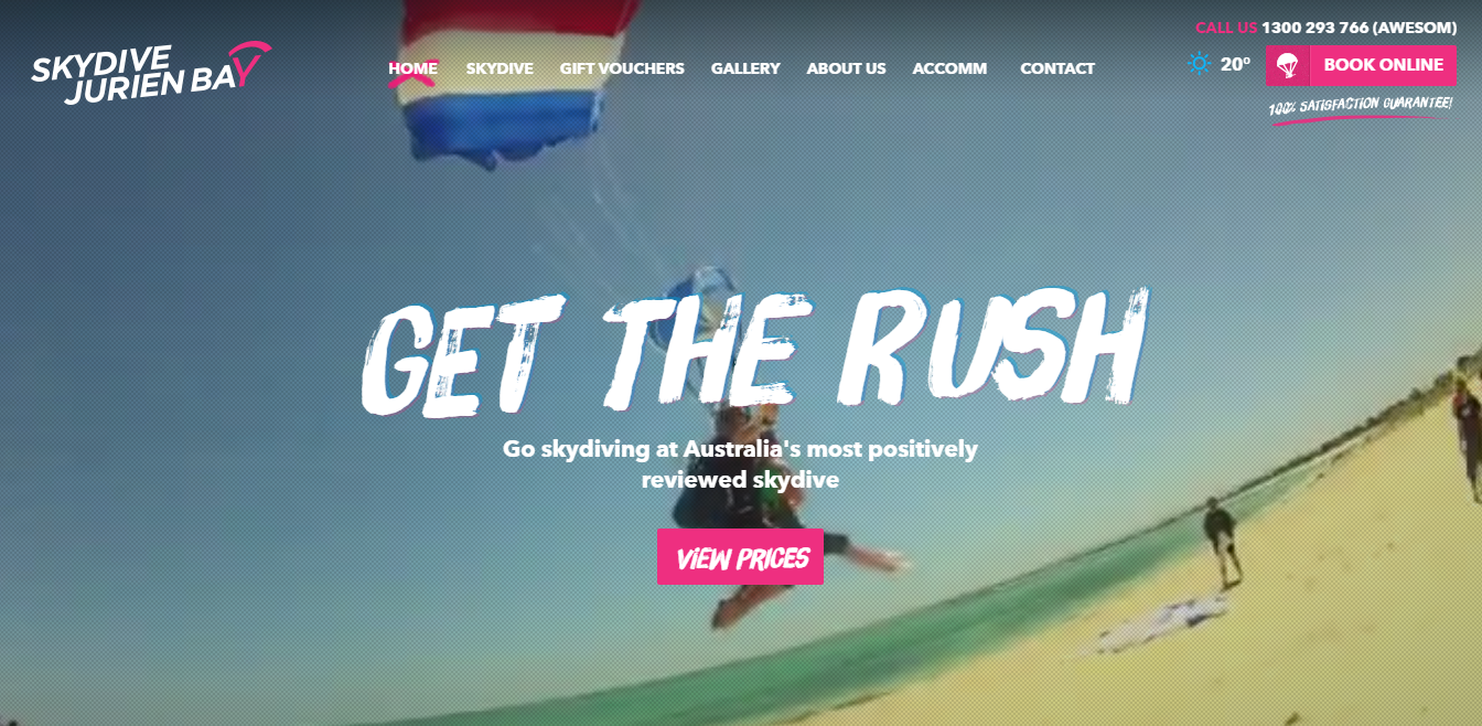
- On a desktop the image is actually a video, so straight away it gives you the feeling of the ultimate experience.
- Your attention is dragged straight to the “action” buttons, which are coloured in pink. The business is wanting you to the prices and also to “Book Online.” Imagine if these boxes were white, they would be completely lost in the home page. Great work. This can quite often be implemented in many websites.
- It is important to identify any road blocks wit your clients, which maybe in skydiving “Are these guys safe and is it the best skydiving place?” They have counteracted this with “Go skydiving at Australia’s most positively reviewed skydive.”
There are many other very good features with this site, however we are just highlighting the home page with standout features.
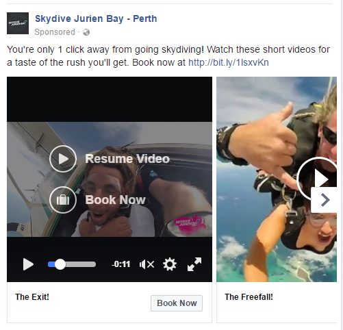
They are also great marketers as they re-targeted me on facebook. Great work guys, this is a great way to increase conversions. I better book in.
2. Michaels chemist was completed by www.c4concepts.com.au located in Perth. It is hard to combine a bricks and mortar stores with an online store.
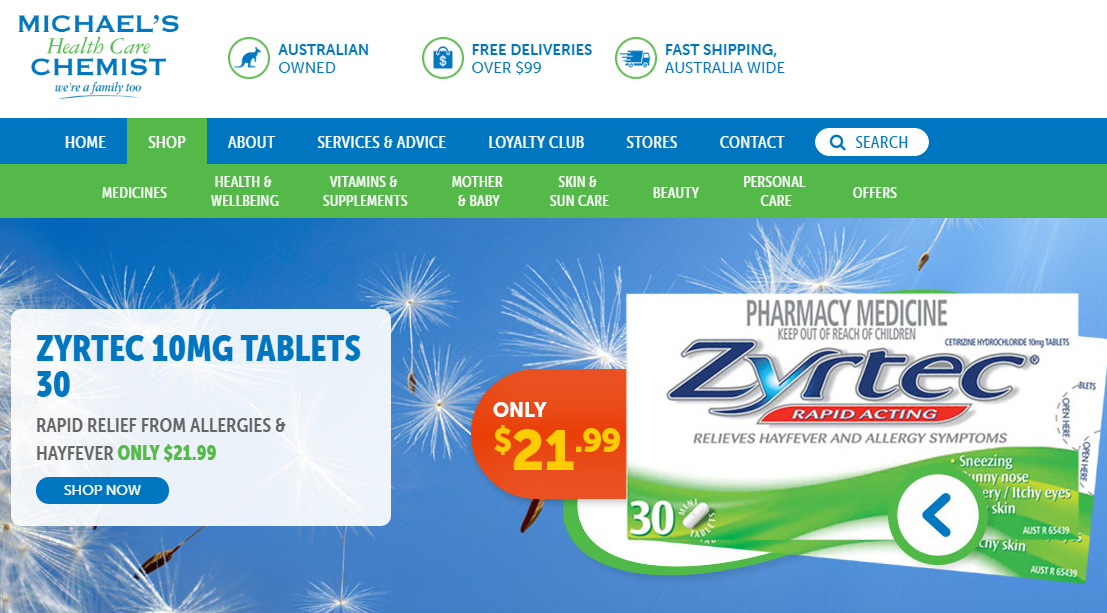
- As soon as you visit this site there are 2 tool bars across the top. This is also mirrored on each page.
The green tool bar is the online shop that is always prominent. With “go to” headings a prospective client can instantly click on one no matter what part of the website. The object is to sell online, but also direct people to their stores.
- Again simple “non road block” headings at the top of the page. “Australian Owned” projects a image of these products are safe due to our strict regulations. Free shipping encourages people to spend more than $99. (I would think that margins are tight in this industry.) “Fast shipping” as in general we need consumable items quickly.
- I have noticed more online stores with phone numbers down the bottom. This may force the customer to scroll down or not call straight away but search.
There is so much more great about this site including drop down categories which consumers find easy to navigate and google also loves.
3. It’s been reported that News Corp paid $40 million dollars for a 25% stake for the below company all due to their website.
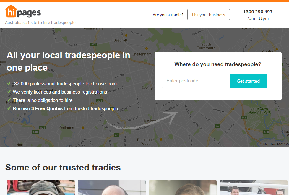
- So simple, has a good headline and 4 “tick” points which gets to the point.
- The customer instantly know’s they just have to put in 4 digits. How easy is that. The hardest thing is to get a customer to start and interact. If you can make the first process dead simple your conversions will increase.
- Notice how the “action” button “get started” is blue. Completely different colour to all other colours on the website.
- There is also a second tier client. This is the tradie. They can also click on the button and list their business easily.
4. Secrets Golf, also draws your eye. We work with Secrets very closely and we know this website converts.
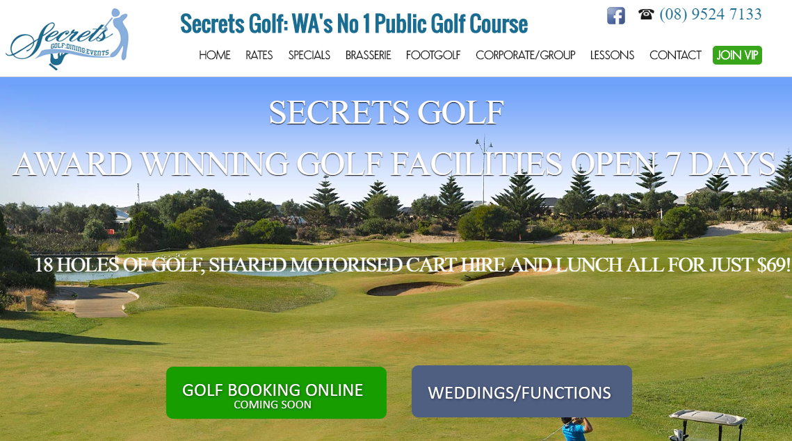
- They have a great special that includes lunch. This is sold before any staff have to ask. The customer see’s their great $69 deal in the middle of the website. You dont need to sell when the customer is already sold.
- Again the 2 biggest buttons are designed to draw the customers eye. This is where Secrets wants the customer to go rather than the top tool bar first.
- The image of someone playing golf creates the experience. Many Golf courses have great images but lack people in the image. Having someone enjoying your service or product helps increase conversions.
- On a mobile the phone number is also clickable and phones straight to the pro shop which is very important for this industry.
5. No surprise to see the most simple website in the world to be worth billions of dollars.
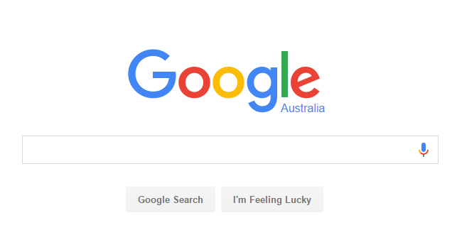
- I love it, so simple it is now even a common phrase. “Google it”
Key elements:
- Keep it simple on the home page. Less is more.
- Have your call to action a different colour to the rest of your website.
- Make sure your customer can take action on the home page and not have to click through to find what they are looking for.
- If you are a bricks and mortar store, have your phone number up the top right hand corner.
- Have an image that engages with your customer instantly.
- Social proof is important for businesses. Have links to your social media. (Make sure your social media is updated regularly.)
- Keep your benefits to the customer brief and to the point.