You already probably know the answer to this as I bet you have never looked at so many websites yourself on a Mobile phone.
Responsive websites automatically adjust to suit the screen you are viewing to provide a better viewing experience.
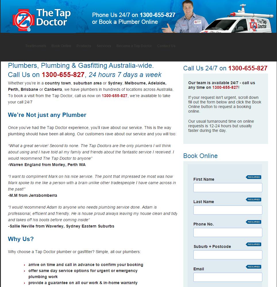
To the right is a sample of a website that is NOT responsive. You will see on a mobile you need to scroll sideways and the most important information like the phone number is not there. A sample of what the website looks like on a desktop is also shown, which looks okay.

Below is what a responsive website looks like on a mobile and then on a desktop.


Here are 5 reasons for your business to have a Mobile friendly website.
- We do individual reporting with all our clients and on average 47% of users are looking at our clients website with a mobile phone. If websites are not easily viewed and easy to navigate on the mobile this can drastically reduce conversions which means loss of business. Business is hard enough to get so we try to maximise our leads.
- 61% of people have a better opinion of a brand if they offer a good mobile experience. It shows the business is forward thinking up, up to date and wants the customer to have everything at their finger tips.
- Having an easy to see clickable phone number so customers can ring you instantly is a must. The phone ringing is the life blood of many businesses.
- If you are looking for good rankings on Google, responsive is better. If Google says so then we just adhere. There is more to it than that but trust us on this, you can check out more on the Google developers website https://developers.google.com/webmasters/mobile-sites/
Mobile usage will increase this year. If your website is not responsive you could those lose even more clients to the opposition.