 Here is what the big players are doing with websites.
Clean Home pages with less clutter.
Big Big Pictures and no banners.
Instant recognition.
Video.
Why? One simple reason. Conversion.
Through testing and measuring it looks like there is an increase of conversion.
Here are some examples below:

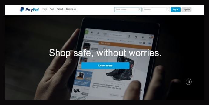
Paypal is a well-recognised brand.
Simple tool bar that gets to the point Buy, Sell, Send, Business and login details. How often do you see a tool bar that has way too many choices? If you give a customer too many choices they get indecisive and don’t choose anything.

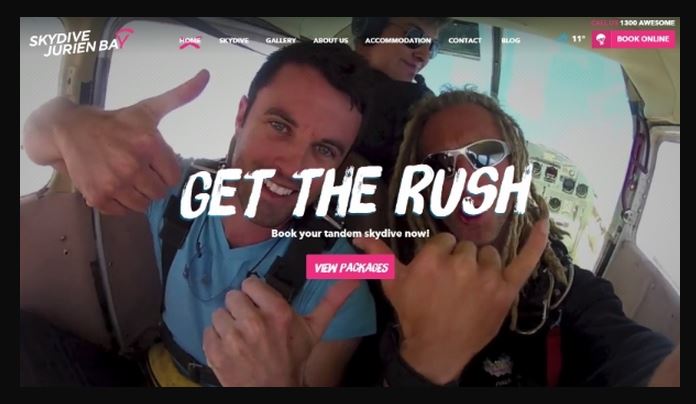
I really like this site. You feel the experience straight away. www.skydivejurienbay.com is actually a video in the background. The contrast of “View packages button” and “Book online” really stand out and draws your eye. It tells the customer what to do without scrolling.

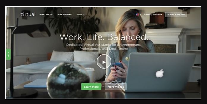
Work, Life, Balance what every business owner has thought about. Nice clear message, great video and straight to the point. They also have lots of other pages which they have on the tool bar as a drop down MOREv.
Great professional, HIGH CONVERTING websites that don’t need to cost the earth.
12 Ways to increase online sales:
Once you have developed a great looking website how do you get visitors to it. More importantly how do you get them to come back and buy from you on a regular basis.
Here are a few tips that will help you improve your websites effectiveness and generate more sales and repeat customers.
http://www.entrepreneur.com/article/79002
